Picking a single paint color for one bedroom is manageable. But coordinating an entire home interior color schemes that flows from the kitchen to the living room to the bedrooms? That’s where most homeowners hit a wall. A cohesive whole house color scheme ties your spaces together, makes your home feel larger and more intentional, and saves you from the visual chaos of mismatched rooms. In 2026, the trend isn’t toward bold, isolated accent walls, it’s toward thoughtfully connected palettes that give your entire home a unified identity. Whether you’re drawn to serene neutrals or richer tones, these five proven color schemes show you exactly how to coordinate your spaces with confidence and clarity.
Table of Contents
ToggleKey Takeaways
- A cohesive whole house interior color schemes approach eliminates visual chaos and makes your home feel larger and more intentional by creating a unified visual narrative across all rooms.
- Effective color coordination uses a layered approach with a primary base tone, secondary variations, and accent colors to maintain cohesion while adding visual interest without requiring identical wall colors.
- Cool-toned palettes (blues, teals, whites) work best in naturally lit homes paired with warm wood tones or brass hardware, while warm earthy schemes (terracottas, sage greens) complement natural materials and farmhouse-style architecture.
- Deep jewel tones create sophisticated home interior color schemes when used strategically in accent walls or lower-traffic rooms paired with neutral accents and warm lighting to prevent a cave-like appearance.
- Always test paint colors with 2-by-3-foot swatches in actual rooms for 3–5 days under different lighting conditions before committing to your whole house color scheme.
- Proper surface preparation with quality primer and two-coat application, combined with room-by-room execution when budget allows, ensures a professional-looking cohesive result that reflects intentional design.
Why Color Consistency Matters Across Your Home
Walking through a home where every room is painted a different color creates cognitive overload. Your eye doesn’t know where to rest, and rooms feel disconnected from one another. A unified interior paint color schemes approach does the opposite, it creates a visual narrative that guides visitors through your space.
Color consistency also has a practical function. Lighter, similar tones make smaller homes feel more spacious by eliminating jarring transitions. Warmer or cooler palettes applied across multiple rooms create a sense of intentionality that signals you’ve thought through your design decisions. You’re not just painting rooms: you’re creating an environment.
That doesn’t mean every wall needs to be identical. Instead, think of your palette as having a base tone (your primary wall color), secondary tones (slightly darker or lighter variations of the same hue family), and accent colors (trim, feature walls, or architectural elements). This layered approach maintains cohesion while adding visual interest.
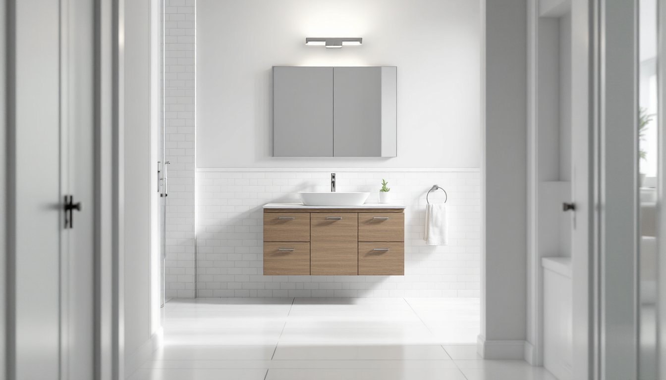
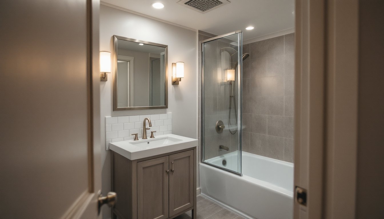
Neutral Elegance: Warm Beiges and Soft Grays
Neutral schemes built on warm beiges and soft grays remain the safest, most forgiving choice for whole-house color coordination. These tones work in any lighting condition, morning sun, evening lamplight, or north-facing rooms without direct light.
For your base color, choose a warm beige like Benjamin Moore’s Hale Navy (if leaning gray) or Sherwin-Williams Accessible Beige (if favoring warmth). These work as your primary wall color in living areas, bedrooms, and hallways. Your secondary tone, maybe one or two shades lighter or darker, becomes your accent for feature walls, built-ins, or the ceiling.
White or near-white trim (like Sherwin-Williams Pure White or Benjamin Moore Simply White) contrasts gently without harsh edges. This palette works beautifully across home interior color schemes because it complements any furniture style, from modern to farmhouse. The key is avoiding pure white walls in combination with pure white trim, the monotony flattens your space. The slight warmth in a beige or greige base creates depth.
Modern Cool Tones: Blues, Teals, and White
If your home gets strong natural light and you want a fresher, more contemporary feel, a cool-toned palette of soft blues, teals, and crisp whites creates a serene, sophisticated environment. This whole house color schemes approach has gained momentum because it feels both modern and calming.
Start with a light blue or blue-gray as your base, Sherwin-Williams Sea Salt or Benjamin Moore Palladian Blue work well in living spaces and hallways. Bedrooms can shift slightly cooler, using Sherwin-Williams Comfort Gray or a pale teal. Kitchens and bathrooms are perfect spots for brighter whites or near-white shades to maintain cleanliness and openness.
The challenge with cool tones is that they can feel cold in rooms without adequate warm lighting. Pair cool-toned walls with warm wood tones (natural or stained trim) or brass hardware to balance the temperature. This creates a modern home interior color schemes that doesn’t feel sterile. Avoid pairing cool grays with cool whites and cool-toned wood stains: the result can feel clinical rather than inviting.
Warm and Inviting: Earthy Terracottas and Sage Greens
Earthy, organic tones, warm terracottas, soft clay, and muted sage greens, create an immediately welcoming atmosphere. This interior paint color schemes approach works especially well in homes with natural wood accents, stone, or farmhouse-leaning architecture.
Choose a dusty terracotta or warm clay base (like Sherwin-Williams Cavern Clay or Benjamin Moore Caliente) in your main living areas. Layer in sage green, Sherwin-Williams Evergreen Fog or Benjamin Moore October Mist, in secondary spaces, bedrooms, or powder rooms. The two tones complement each other without competing: they’re from the same warm temperature family.
Cream or warm white trim keeps things balanced and prevents the palette from feeling too heavy. This combination shines when paired with natural materials, think wood shelving, linen upholstery, or terracotta pots. The whole house color schemes becomes an extension of the natural world, which explains its enduring appeal across different design eras.
Bold and Sophisticated: Deep Jewel Tones with Neutral Accents
For homeowners willing to commit to drama, a palette anchored by deep jewel tones, rich forest greens, navy, or deep teals, paired with neutral accents creates a bold, sophisticated whole house color schemes. This approach requires confidence and proper lighting, but the payoff is a distinctly personal home.
Use your jewel tone as an accent wall or in lower-traffic rooms like a dining room or study. Keep primary living spaces (kitchens, main hallways) in soft grays or warm beiges to prevent overwhelming your home. Apply jewel tones to trim or built-in cabinetry to anchor them architecturally rather than treating them as a wall color in every room.
The real trick: ensure these deeper shades are complemented by ample warm lighting. Recessed lights, pendant fixtures, or warm-toned LED bulbs prevent deep jewel tones from feeling dark and cave-like. Pair jewel tones with brass or gold hardware and natural wood to add warmth. These home interior color schemes work in homes with architectural detail because the tones emphasize crown molding, wainscoting, or built-ins.
How to Test and Implement Your Chosen Palette
Picking colors from a paint chip is not the same as living with them on your walls. Before committing to a whole-house interior paint color schemes, test every color in the actual rooms where you’ll apply them.
Buy sample quarts of your top 2–3 color choices (around $5–8 each). Paint 2-by-3-foot swatches on different walls in each room, especially walls with different lighting throughout the day. Morning light in a north-facing bedroom behaves completely differently than afternoon sun in a south-facing kitchen. Live with the samples for 3–5 days, observing them in natural and artificial light.
Once you’ve committed, prepare surfaces properly. Patch holes, fill nail pops, and sand glossy surfaces with 120-grit sandpaper. Prime all patched areas with a quality primer-sealer (avoid cheap primer: it doesn’t hide stains or seal surfaces consistently). A single coat of good primer beats two coats of cheap primer every time.
For paint application, 35 Failproof Paint Color Ideas For Every Room provide expert guidance on execution. Use quality roller frames (not disposable), quality bristle brushes for edges, and paint in two coats. Allow 4 hours between coats in warm, dry conditions. A single coat of paint will appear uneven and won’t hide imperfections.
Carry out your palette room-by-room if budget allows. Start with high-traffic areas (living room, kitchen, hallway). As you move from room to room, the visual continuity becomes clear. Paint ceilings in white or a tinted shade one or two shades lighter than your walls to add height and prevent a box-like feel.
Conclusion
A coordinated whole house interior color schemes ties your home together visually and emotionally. Whether you choose warm neutrals, cool tones, earthy hues, or bold jewel tones, the principle remains the same: plan your palette before opening a paint can, test colors under real lighting conditions, and prep surfaces meticulously. The result is a cohesive home that reflects intention and craftsmanship, and that’s worth the extra planning upfront.